Client case study · 4 min read
Bold Performance
A confident digital home for Brock Jones’s personal training practice, connecting his coaching approach with the people ready to put in the work.
Visit website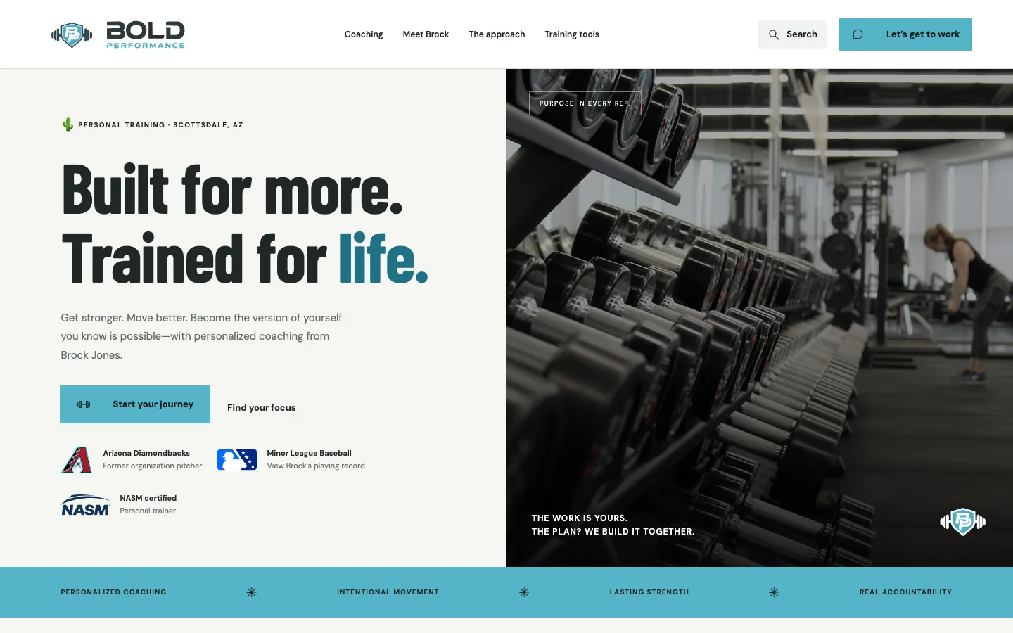
- Astro
- React
- TypeScript
- Bun
- Flox
- Vercel
The brief
A personal-training website has to communicate more than a list of exercises. It needs to introduce the coach, make the approach understandable, and help a visitor decide whether they want to start a conversation. Bold Performance brings those responsibilities together for Brock Jones’s coaching practice in Scottsdale, Arizona.
The site combines a public introduction with dedicated coaching pages, a searchable training toolkit, and a detailed intake. That structure gives someone who is ready to inquire a direct route forward, while leaving room for visitors who first want to understand the work.
Brand ideation

Color palette
Performance cyan
#55B4C9
Deep teal
#1E7184
Charcoal
#161C1D
Warm white
#F6F6F1
Typography & voice
- Headlines
- Barlow Condensed
- Body & interface
- DM Sans
Direct, energetic, and grounded in purposeful training.
The shield and BP monogram carry the identity at smaller sizes. Keep clear space around the artwork; use deep teal rather than cyan for small text on light surfaces.
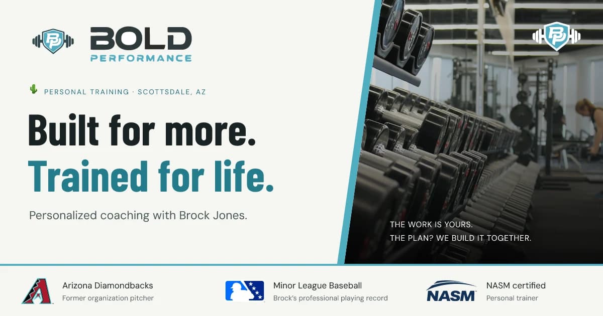
The visual direction pairs the energy of a training environment with a practical, readable interface. Large condensed headlines create a strong first impression; quieter body typography gives coaching explanations and tool instructions room to breathe. The gym photography establishes the setting without asking decorative effects to carry the message.
The guiding design idea is a clear progression from ambition to action. “Built for more. Trained for life.” introduces the coaching proposition, while the surrounding service descriptions, credentials, and calls to action give that proposition substance.
| Element | Treatment | Purpose |
|---|---|---|
| Primary accent | Cyan, #55B4C9 | Draw attention to actions and key details |
| Text | Deep charcoal, #161C1D | Maintain strong contrast |
| Background | Off-white, #F6F6F1 | Give the content a calmer reading surface |
| Headlines | Barlow Condensed | Establish a direct, athletic tone |
| Body copy | DM Sans | Keep longer explanations approachable |
The same direction extends to the logo assets and social preview. Those pieces make a shared link feel connected to the website rather than like an unrelated promotional graphic.
From introduction to inquiry
The navigation separates coaching information from practical tools. A visitor can read about the coach, explore a relevant service, or use the toolkit before deciding whether to reach out. Twenty searchable training tools make the site useful beyond the first visit.
The intake gathers context before a conversation begins. Its delivery behavior is deliberately explicit: the site can prepare an email draft, or send through Formspree when configured. Preparing a draft is not treated as a successful submission. That distinction matters when a potential client is trusting the website with their next step.
Technical approach
Astro serves the content as static pages. React is reserved for the interactive toolkit, keeping the informational experience independent of a large client application. TypeScript supports the implementation, Bun runs the development and verification commands, and Flox defines a repeatable environment.
The architecture separates content delivery from interaction and inquiry handling:
flowchart TD
  Content[Coaching content and tool guides] --> Astro[Astro static build]
  Astro --> Pages[Public HTML pages]
  Pages --> Tools[React training tools]
  Pages --> Intake[Detailed intake]
  Intake --> Draft[Email draft]
  Intake --> Configured[Formspree when configured]
  Astro --> Discovery[Sitemap and Markdown]
This division makes routine content updates straightforward while preserving richer behavior where it is useful. Vercel hosts the output and deploys changes from the main branch. The repository’s shared checks cover formatting, documentation, validation, tests, and the production build.
Codex and agentic use
Codex was used in the design and implementation workflow: working through the site’s presentation and translating the intended experience into code. The useful unit of review remained the actual website—its content, interactions, and rendered pages—not simply whether generated code compiled.
The other side of agentic work was making the finished website understandable to agents. is-agentic was used to guide improvements to discovery and crawlability. The site provides a sitemap, robots rules, llms.txt, and llms-full.txt. Markdown is generated from the rendered content, so the machine-readable version follows the information visitors see.
Vercel middleware handles requests for text/markdown; ordinary browser visits receive HTML. Tool calculations still run locally in the browser. The site does not advertise a booking or payment API that an agent could mistake for an available capability.
Delivery and lessons
The delivered experience connects positioning, useful tools, and a clear inquiry path. It also includes responsive layouts, social metadata, and documentation for maintaining the site.
The central lesson is that a service website becomes more useful when visitors can do something relevant before contacting the business. The training tools support that idea without obscuring the main purpose: introducing the coach and helping someone take a considered next step. Conversion uplift and coaching outcomes are not claimed here; those require evidence beyond the implementation itself.